keyser soze wrote:
OK, I'll be the first to admit it. I don't really understand those graphs.

No upset here at all.
They're enlightening when you get your head around them.
See here for the explanation:
https://experimental361.com/2018/02/18/ ... -feb-2018/Relevant bits also here:
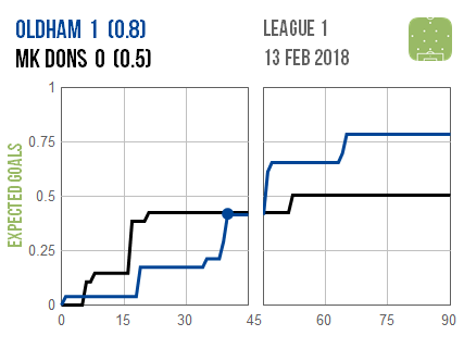
There are two numbers next to each club’s name:
The first number is how many goals they actually scored.
The second number (in brackets) is how many goals the average club
would/should have scored from their shots.
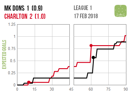
The second number (in brackets - the
Expected Goals) are what the lines track, with
dots shown on the lines wherever goals were actually scored during the game, if any.
Every jump upwards in a line, is a shot by that team, with bigger jumps upwards corresponding to
more promising chances.
The lines on the graphs track how each club’s
Expected Goals tally increased over the first & second 45 min halves of the match.
Expected Goals, are the number of goals that an average team
should've/would've scored, from those chances created by that team over the course of the match.
So like I said, that game should probably have been a 1-1 draw on the chances created & Expected Goals overall, but for every 10 shots like the first one let in from distance after gifting Charlton the ball 10 mins into the first half, you'd normally only expect to concede from a shot like that on 1 in 12 occasions.
However, I guess we were the 1 in 12 times it goes in lol...
Have a look at some of the other matches on there with other teams, and you'll soon get what they're getting at & how they tell a much more accurate tale of what really happened in a match, who was lucky/unlucky and who deserved to win etc. than the basic possession, shots, and shots on target stats do - hth.
https://experimental361.com/2018/02/18/ ... -feb-2018/